Why Choosing Your Paint Color Palette First Creates a Cohesive, Intentional Space
Why Choosing Your Paint Color Palette First Creates a Cohesive, Intentional Space
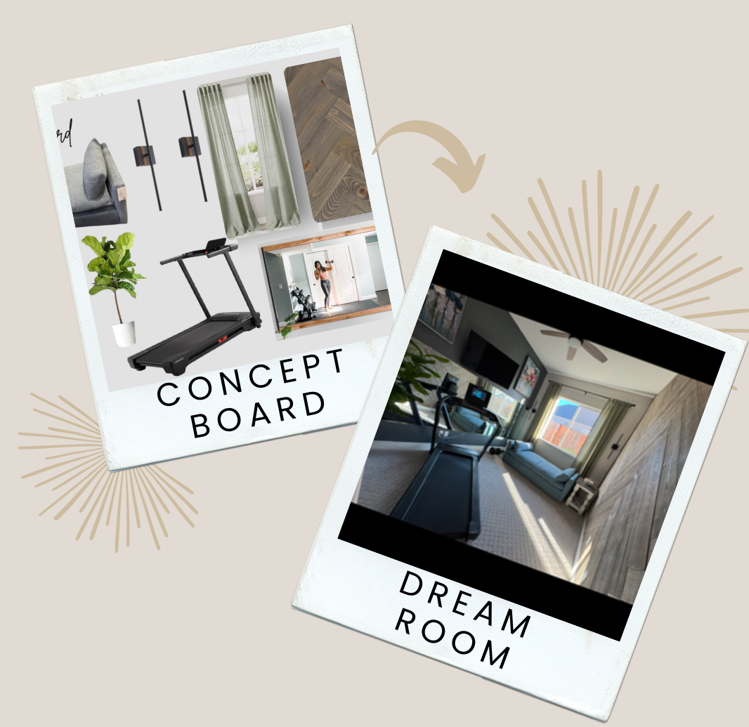
When embarking on a decorating or styling project, it’s tempting to dive straight into sourcing furniture, textiles, and accessories. But before selecting that perfect boucle accent chair or layering in organic textures, there’s one foundational decision that sets the tone for everything that follows: your paint color palette.
Establishing your color scheme at the outset isn’t just a matter of preference, it’s a strategic move that ensures cohesion, clarity, and visual harmony throughout the space. Whether you're refreshing a single room or styling an entire home, the palette you choose becomes the invisible thread that ties every element together.
The Meticulous Art of Choosing the Right Colors
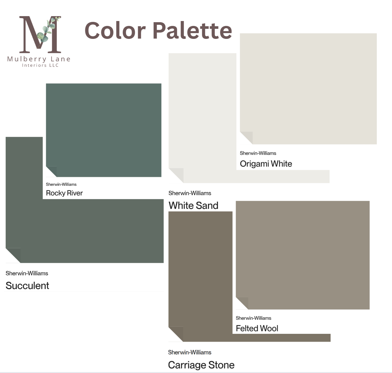
Color is emotional. It’s psychological. And it’s deeply personal. That’s why selecting the perfect palette requires more than flipping through swatches or following trends. A soft greige might evoke calm and sophistication, while a deep navy can ground a space with quiet drama. But beyond aesthetics, the right color must also complement natural light, architectural features, and the client’s lifestyle.
Here’s where the meticulous side of color selection comes in:
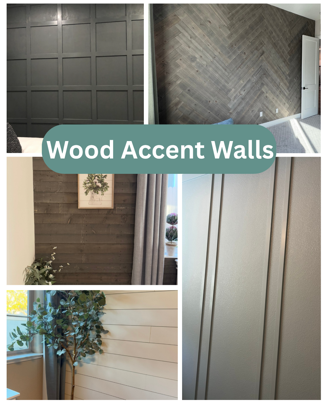
- Undertones matter. A warm white with yellow undertones will behave very differently than a cool white with blue undertones, especially when paired with wood tones or metal finishes.
- Lighting shifts everything. Morning light, afternoon shadows, and artificial lighting all affect how a color reads. Sampling paint on multiple walls and observing it over time is essential.
- Context is key. A color that sings in a coastal cottage may feel out of place in a modern urban loft. The palette must reflect the space’s identity and purpose.
This level of precision ensures that your color choices don’t just look good, they feel right.
The Power of the 60-30-10 Rule
Once your palette is defined, the next step is applying it with balance. Enter the 60-30-10 rule—a timeless design principle that helps distribute color in a way that feels intentional and visually pleasing.
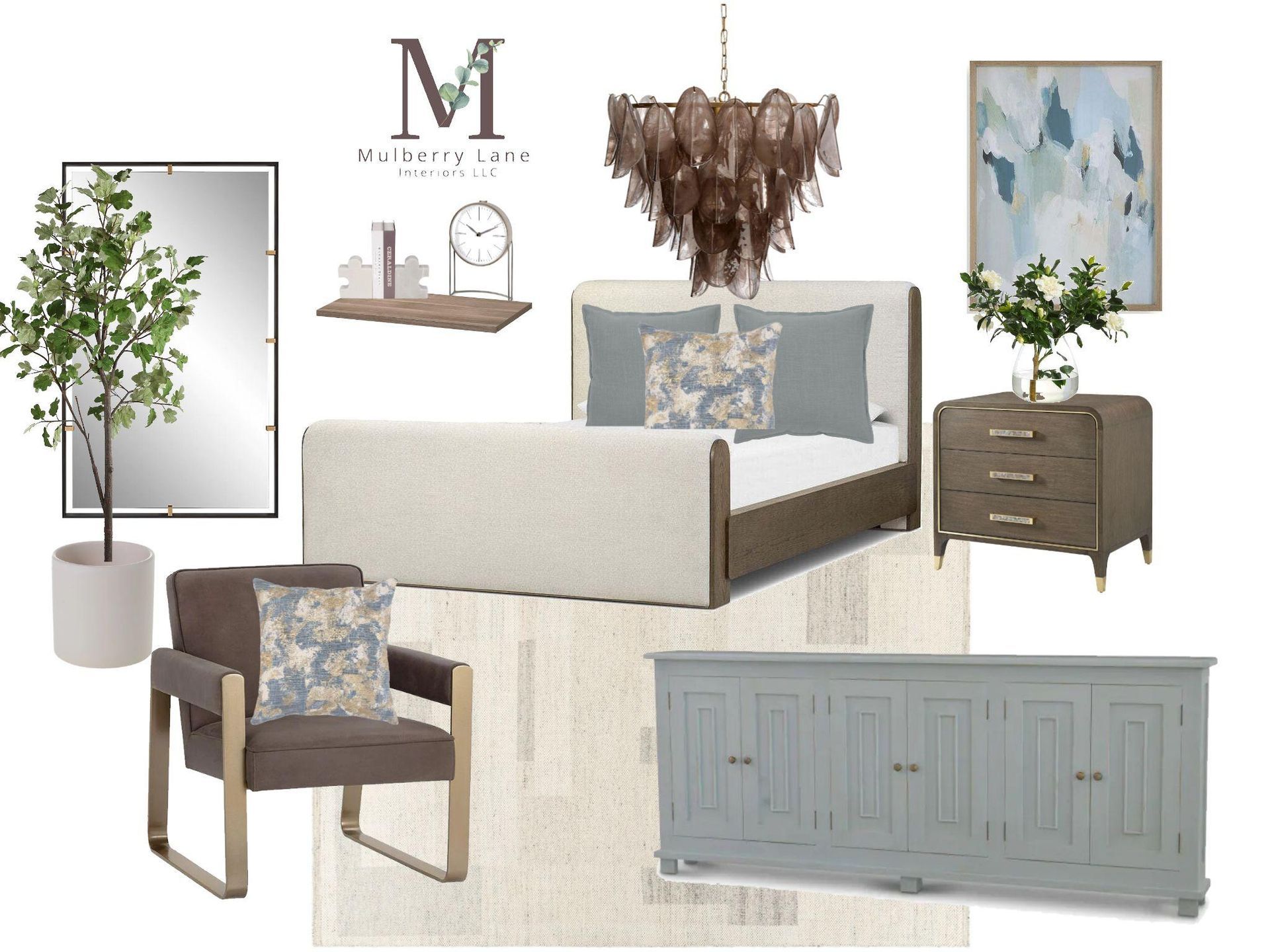
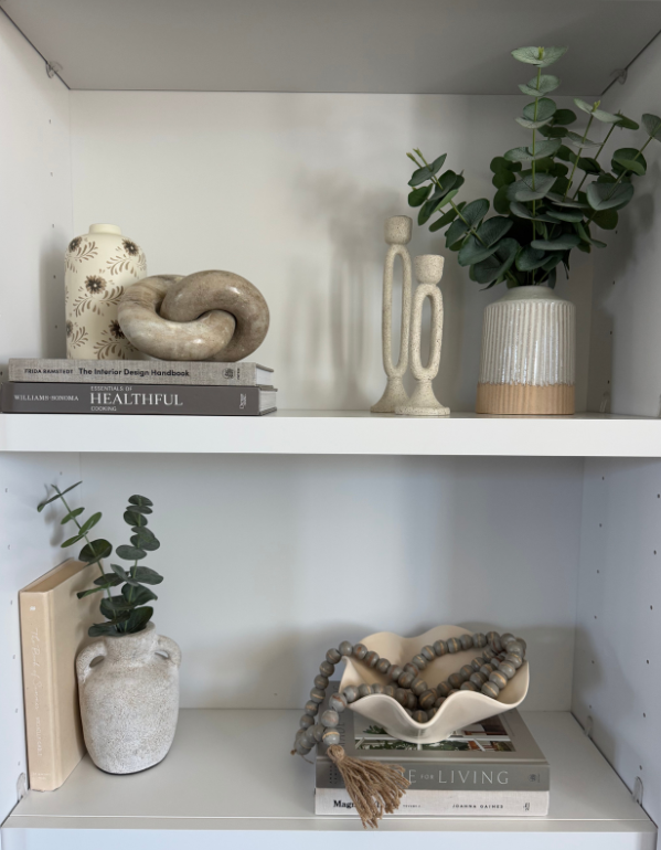
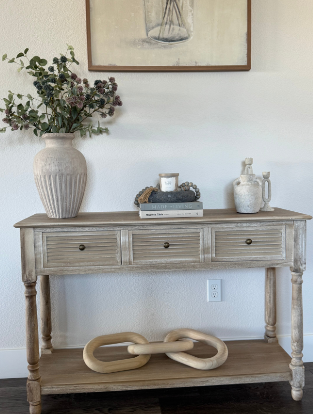
- 60% Dominant Color: This is your anchor. Often found on walls, large furniture pieces, or flooring, it sets the overall tone of the space. Think soft taupe, warm white, or a muted sage.
- 30% Secondary Color: This adds depth and contrast. It might appear in upholstery, cabinetry, or rugs. For example, a rich charcoal or dusty rose can complement your dominant hue without overpowering it.
- 10% Accent Color: This is your pop. It should be used sparingly but strategically. It could show up in artwork, throw pillows, or decorative objects. Metallics, bold hues, or even black can serve as striking accents.
This ratio creates rhythm and hierarchy, guiding the eye and preventing visual clutter. It’s especially effective in modern contemporary spaces, where restraint and intentionality are key.
Color as a Unifying Force
When the paint palette is chosen first, every subsequent decision becomes easier and more aligned. Wallpaper, textiles, furniture finishes, and even greenery can be selected to harmonize with the established tones.
For example, if your palette includes a warm clay as the accent, you might source terracotta vases, rust-toned linens, or artwork with earthy undertones. Suddenly, the space feels curated—not cobbled together.
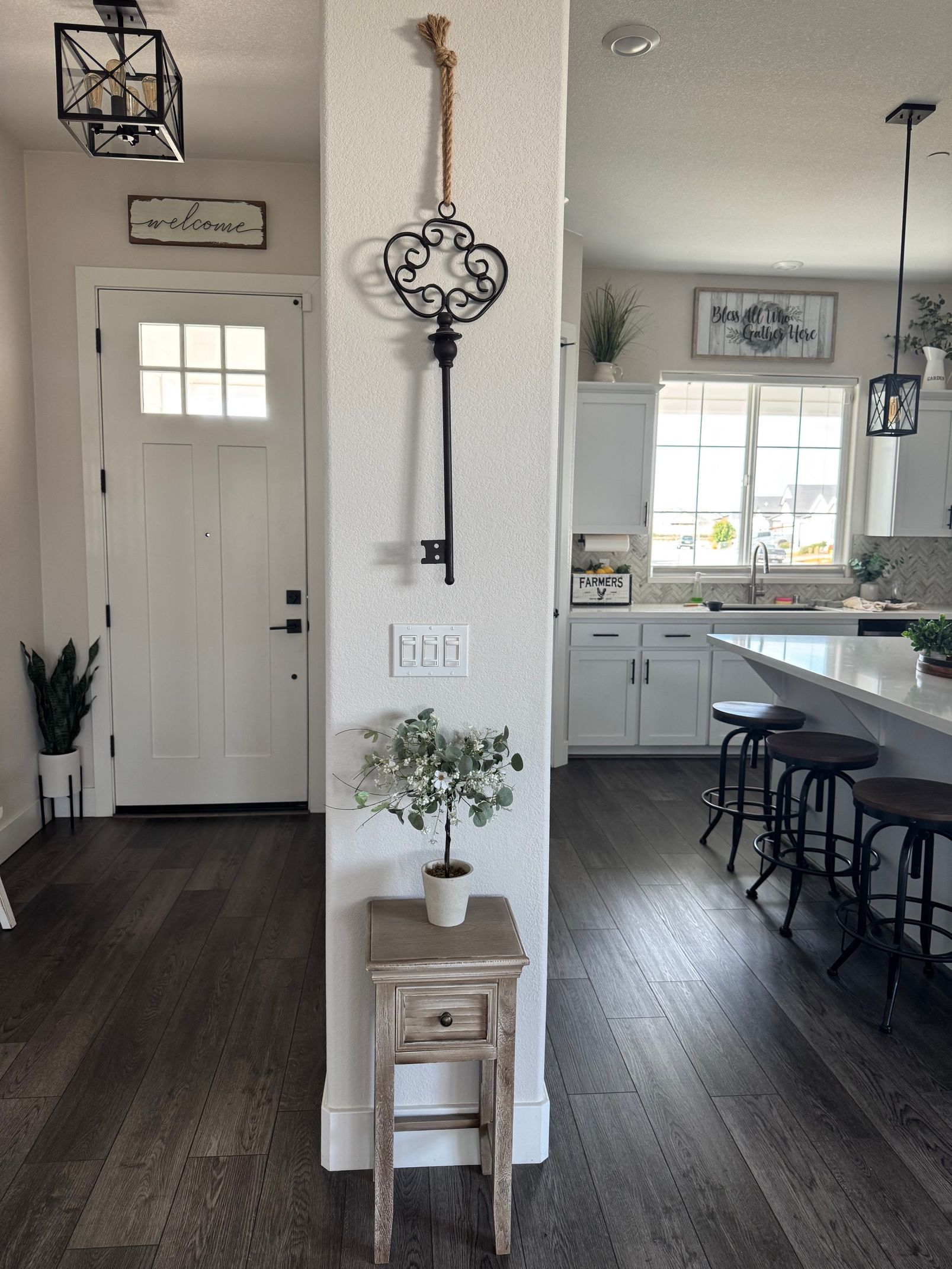
This approach also supports flow between rooms. By repeating core colors in varying proportions, you create continuity without monotony. A hallway painted in the dominant hue of the living room, with accents pulled from the adjacent dining area, makes the entire home feel connected.
Styling with Confidence
For stylists and decorators, having a defined palette is like having a compass. It keeps you focused, prevents overbuying, and ensures that every piece contributes to the overall vision.
It also empowers clients. When they understand the “why” behind each color choice, they’re more confident in their decisions and more excited about the transformation.
And let’s not forget the emotional impact. A cohesive color story doesn’t just look beautiful, but it feels intentional, calming, and complete. It’s the difference between a room that’s styled and a room that’s truly designed.
Whether you're refreshing a guest bedroom or styling a full home, starting with your paint color palette isn’t just smart, it’s essential. It’s the quiet hero of every cohesive space, guiding your choices and elevating your design from good to unforgettable.
If you’d like help curating palettes that align with your home's aesthetic, I’d love to collaborate. We can even build sourcing lists around your chosen hues to take the work out of finding a cohesive palette.